
For this weeks article, I found one on the recent outbreak of the Coronavirus the title of this article is as follows: Coronavirus Finds Fuel in a World of Migrants this article is about how the Coronavirus has spread rapidly through the migrant population of all parts of the World especially in counties like Thailand, Singapore, India, Afghanistan, Iran. The reason for this rapid spread in these counties is first tried to when they close down their borders with their Neighbors, which for the migrant population panicked in these countries which caused the spread to happen faster and hit this part of the population hard as well as losing their jobs overnight in some countries. Along with some of the quarantine areas that these people are having to live in since most are in extremely close-quarters and not well-maintained Buildings and toilets especially. This article connects to geography by how the migrant population has had to move across country borders that not only made the spread worse and spread to other areas.
Do Not Use Misc
Blog Population Croatia- Russia
Croatia
- Males per 100 females-93.2
- People per square kilometer-75.9
- Number of children per woman-1.4
- Current Population- 4.2M
- Estimated Population in 2050- 3.5M
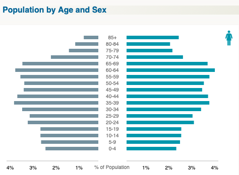
Croatia's population pyramids is in stage four, the population in 2050 is expected to decrease. While is does look like the birthrate is more then the death rate, but it also looks like the population will take a decrease as the population of 20-24 through 0-4 is not as steady as the years before them.
Russia
- Maleas per 100 females- 86.1
- People per square kilometer- 8.7
- Number of children per woman-1.6
- Current Population- 141.9 M
- Estimated Population in 2050- 129.9M
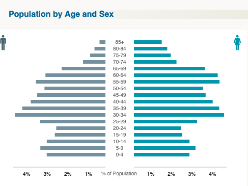
Russia's population pyramids is in stage three , the population in 2050 is expected to decrease. It looks like the population is mainly 30-34 years old and that the birthrate is slowly decreasing, with the death rate going to increase.
Population Italy Spain – Kells
For the population blog I chose Italy and Spain as the two countries for which I am comparing.
Spain Italy
Males per 100 Females = 97.6 93.0
People per square kilometer= 99.6 211.9
Number of children per woman= 1.5 1.5
Current Population= 49.7M 62.3M
Estimated Population 2050= 52.5 M 61.4 M
The DTM graphs for these two countries look very similar, with nothing having stage 4 graphs. Both countries boast populations with a majority in the age groups between 40-44, 45-49, and 50-54 years of age. The countries differ however on the basis that while Spain is expected to grow in population (though minimally) Italy is supposed to decrease by the time that 2050 comes around. Italy has a higher population percentage in the elderly populations while Spain has a higher population in the younger populations. This means that when Italy's elder population begins to die off there are less younger people to replace them and keep the population the same. Meanwhile Spain has the opposite.
Blog: Population Geography
3. Note the following for each country: New Zealand
Males per 100 Females: 100.3
People per square kilometer: 18.4
Number of children per woman: 1.9
Current Population: 4.9M
Estimated Population 2050: 5.9M
Note the following for each country: Ireland
Males per 100 Females: 99.8
People per square kilometer: 74.4
Number of children per woman: 1.9
Current Population: 5.1M
Estimated Population 2050: 6.3M
4. Describe and compare the structure of the population pyramids and indicate the stage of the population transition for each. (Hint: Looking at the graph, what does it tell you about the birth rate and death rate over time of the country?)
in New Zealand, the brith rate for the males is 3.3% and for the female it is 3.1%. While in Ireland the birth rate for the males is 3.6% and for the females it is 3.4%.
Then the population where it is the greatest in New Zealand is the ages 25-29. The males is 3.8% and for the females is 3.6%. While in Ireland, the population where it is greatest is the between the ages 35-39. Both males and females both are at 4.1%.
Then lastly for the ages where the population is less is at the ages 65 and older.
Overall, the graphs tell me that the populations for both countries is that it is greater from birth to their middles ages. Then population decreases when they are 65 and older.
5. Finally, how will the two countries compare (to current population) in 2050? How is this reflected in the population pyramids?
If you wish, you can include the population pyramids, but that is NOT a requirement.
The population in 2050 for New Zealand is 5.9M and for Ireland it is 6.3M. That tells me that Ireland will have a greater population in 2050 by 0.4M people. In the graphs, it shows that it is increased from the "Current and Projected Population" graph.
Population blog: Montano
The two countries I selected are Japan and South Korea
Japan:
Males per 100 females: 93.9
People per kilometer: 345.3
Number of children per woman: 1.4
Current population: 125.9 million
Estimated population in 2050: 107.2 million
South Korea:
Males per 100 females: 100.4
People per kilometer: 532.8
Number of children per woman: 1.3
Current population: 51.6 million
Estimated population in 2050: 47.7 million
Japan has a slightly larger female population than South Korea's which you can see on the pyramid because there's more on the right side. Both pyramids are larger in the middle from people in their early thirties to late sixties. There are way more people that are 30+ than young people in both countries. It appears that the birth rate began to lower drastically about 30-40 years ago. This explains why the population in both countries will start to lower drastically within the next 10 years. By 2050, both countries will experience a large population decrease due to the die of the older generations. This makes sense because the two largest age groups in Japan according to the pyramid are adults in their late 40s and late 60s. Unless the birth rate increases dramatically within the next 30 years there will be a large population decrease.
Population Blog.
Elton Chanar
April 10, 2020
Countries: Greenland and Uruguay
3.
Greenland
108.7 Males per 100 Females
0 People per square kilometer
2.0 children per woman
Current Population: 57.7K
Estimated Population 2050: 49.4K
Uruguay
93.7 Males per 100 Females
19.3 People per square kilometer
1.8 children per woman
Current Population: 3.4 million
Estimated Population 2050: 3.5 million
- The population for Greenland for the age group 0-4 has a percentage of a little less than 4% for both male and female. For Uruguay both male and female percentage is a little over 3%. The birth rate for both countries are approximately the same but the birthrates for Greenland is higher than Uruguay. The population for Uruguay would increase over time and Greenland population would decrease over time. The death rate for Greenland is way fewer than Uruguay does.
The population for Greenland right now is 57.7K and the expected population for 2050 is 49.4K. The population for Uruguay is 3.4M and the expected population for 2050 is 3.4M. The population pyramid for Greenland would shrink for the birth rates and Urguays would expand.
I picked Indonesia and Mongolia for this assignment because I know them to have dramatically different populations sizes and climates. I found that despite radically different population sizes and densities, they are at similar stages of population maturity and have similar growth expectations. They are both between stages 2 & 3 and in 50 years-- barring war or disaster-- they will both be at stage 3.
-----------------------------------------------------Mongolia Indonesia
Males per 100 Females 95.5 100.2
People per square kilometer 2 146.2
Number of children per woman 2 2.1
Current Population 3.1 M 264.9 M
Estimated Population 2050 3.7 M 300.2 M
Est. Population increase (%) 1.19 1.13
Structure of the pop. pyramid sharp bow at 30-34 & 5-9 soft bow at 40-44 & 15-19
Stage of pyramid between 2 & 3; closer to 2 between 2 & 3; closer to 3
Future Pyramid Stage (2050) 3 3
Blog 5: East Asia and Southeast Asia
Courtney Williams
April 9, 2020
https://time.com/5598032/southeast-asia-plastic-waste-malaysia-philippines/
‘Southeast Asia Doesn’t Want to Be the World’s Dumping Ground. Here’s How Some Countries Are Pushing Back’
In the article it tells us about the “global trash trade'. Wealthier countries have been shipping their plastic waste to countries in Southeast Asia. But now, the countries in Southeast Asia are shipping the contaminated unrecyclable trash back to where it came from. Many of the garbage is coming from places such as the U.S., Canada, France, the U.K., Germany, etc. People believe the richer countries are taking advantage of poorer countries, and that they ship the trash to those countries because it’s cheaper than doing it in their own country. Many of the countries are beginning to send their trash back where it came from because it is becoming too much for them.
Geographic concepts involved are the land and waters. Many of the plastic is covering agricultural communities, turning them into toxic dumpsites. They are ending up on the land and shores of countries, along the roads and releasing fumes into the airs.
Blog 4: Population Geography
Courtney Williams
April 9, 2020
2.) Brazil and Australia
3.)
Brazil
97.1 males per 100 females
People per sq. km- 25.2
Children per woman- 1.7
Current population- 210.3M
Estimated population 2050- 232.3M
Australia
98.8 males per 100 females
People per sq. km- 3.3
Children per woman- 1.7
Current population- 25.1M
Estimated population 2050- 32.5M
4.) About the same percentage of people being born in Brazil and Australia are the same, they are both between 3-4%. Brazil stays under 4% until the age of 25-29. Then decreases below 4% but rises above 4% from 30-39, but after that age group it begins to decrease. While Australia stays below 4% from 0-85. The highest age percentage is the age group of 25-29 and as the get to 50+ age groups it begins to decrease.
5.) For both Brazil and Australia, the population will grow. Brazil’s population will have about 30 million more people by 2050 while Australia will have about 6 million more.
Population Geography
For this week's blog post the two countries I have chosen are France and the United Kingdom that I will compare for the demographic transition model (DTM) so here are the two characteristics for the two counties:
France
Males per 100 Females = 95.9
People per square kilometer=105.6
Number of children per woman=2.1
Current Population=67.6M
Estimated Population 2050=69.5
United Kingdom
Males per 100 Females=99.2
People per square kilometer=270.5
Number of children per woman=1.9
Current Population=65.4M
Estimated Population 2050=71.2M
From the Data shown on the DTM Graphs both France and the United Kingdom seem to both have a relatively large portion of their populations in the ages of 50-54 and 55-59 for which around 3.2% to 3.4% respectfully, where the two counties begin to deviate from each other significantly is one in France the average age for a Women to be over the age of 85+ is 2.3% which compared to the United Kingdom is only 1.7% while on the men side of things is about the same for this group at 1.1% in France and 0.9% in the United Kingdom. Another area the separates France and The United Kingdom is in what the Projections for Population growth will be 25.3 more in the United Kingdom than in France in 2050 even when in France the er of children per woman is 2.1 compared to The United Kingdom`s 1.8.